
Rupeezy · Design system · 2024–25
Enough system to stop redrawing the same field
The first system I’d built, kept deliberately small: colour, states, and the components four designers used every day.
The cost
Four designers, four versions of the same field
Two products, and new screens starting from whichever old file was closest.
Nothing broken on any one screen. The cost was drift — and every fix repeated in as many files as it had been copied into.
The decision
Why it stayed small on purpose
A full foundational system was months of work with nothing usable until the end — against releases that had dates.
Not an extensive system — a sufficient one. A small library four designers actually pulled from beats a large one nobody reached for.
Three decisions
Where the thinking went
Intent first, appearance second
My instinct was a palette people copy hexes from — which fails the moment someone needs a red that isn’t the error red. Colour became five semantic intents; every component is an intent crossed with a treatment. You pick meaning, not a swatch.
States are the component
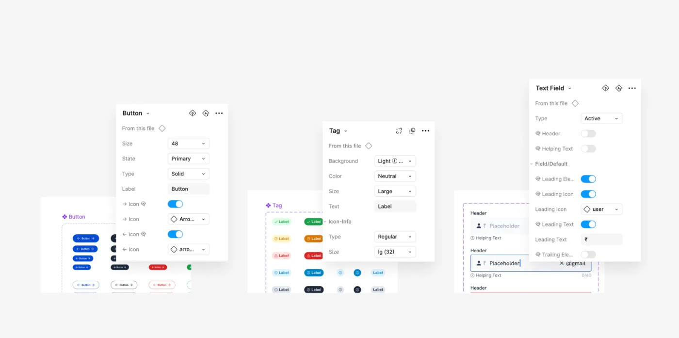
Most duplication wasn’t new components — it was the same field redrawn for an error message or a counter the original didn’t carry. So the field shipped with its label variants, five states and its counter inside. The KYC screens are where that paid for itself.
Two surfaces from day one
Dark mode isn’t a colour swap — it’s a second set of decisions about depth, borders and disabled text. Every component was drawn as a pair, and elevation got its own set per surface. Drag the handle to wipe between them.
Getting it used
The library had to beat copying
Adoption wasn’t going to come from a rule. It came from being the shortest path.
Pulling a component was faster than hunting for the version someone trusted, and engineers read values and states in Dev Mode instead of waiting on redlines.
Honestly
What I can do, and what I haven’t
One system, built small, at one company. Worth being straight about.
Comfortable doing
Haven’t done yet
Next time: agree one countable measure with engineering and set contribution rules in week one, before publishing anything.
Appendix
A glimpse of the library
A few pieces rebuilt as live HTML. The full set lives in Figma.
One set of intents throughout: a success tag, a success button and the success step are the same decision at three volumes.